Product Design, UX, UI – 2nd Year University Project
Sustainability advice is everywhere. Sustainable behaviour is still rare. Good intentions don't recycle packaging - better design might.
The Problem
People aren't failing to recycle because they don't care. They're failing because the system makes it genuinely hard.
A survey of 14 participants aged 19 - 30 found that 86% admitted to wish cycling, tossing something in the recycling bin and just hoping for the best. Most didn't know their bin collection day. When unsure, the majority defaulted to general waste rather than risk getting it wrong.
The frustration wasn't apathy. It was confusion. Rules vary by location, symbols are unclear, and information is scattered. The same pattern appeared while shopping, most participants wanted to make sustainable choices but didn't feel equipped to act on that awareness in the moment.
The gap wasn't motivation. It was information, delivered at the wrong time, in the wrong place.
The Process
I carried out competitor research into a range of recycling and waste-related apps, including Bower, Recycle Coach, TrashOut, Recyclingbank, ecoATM and other sustainability platforms. I compared their platform availability, core functionality, visual design, user reviews, pricing models, strengths, weaknesses and overall sustainability focus. This helped me identify that many existing solutions focus on separate actions, such as scanning packaging, reporting litter or checking bin collection schedules. From this, I saw an opportunity to design a more connected experience that supports users throughout the full disposal journey: before, during and after making a waste-related decision. The research kept surfacing two problems that existing recycling apps hadn't fully solved.
The first was location dependency. Recycling rules vary significantly across councils, and many participants, particularly those who had recently moved or were renting, had no reliable way to find out what applied to them locally. Several noted their main source of information was whatever their landlord had told them. This shaped an early decision to build the app around the user's current location, surfacing rules and collection days specific to where they actually live rather than offering generic guidance.
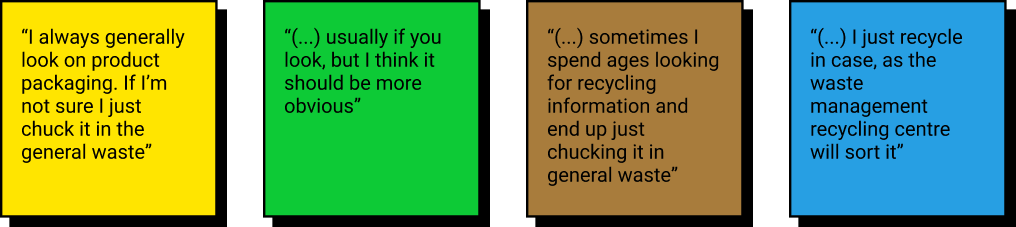
The second was wish cycling. Most participants knew they were doing it. They'd stand at the bin, unsure whether a piece of packaging was recyclable, and throw it in hoping for the best. This was the moment the app needed to address - not before, not after. It led to the decision to design a scan feature that gives users a clear, immediate answer at the point of disposal, removing the doubt that causes the behaviour in the first place.
Both decisions came from the same underlying finding: people didn't need more information about recycling in general. They needed the right information, in the right place, at the right moment.
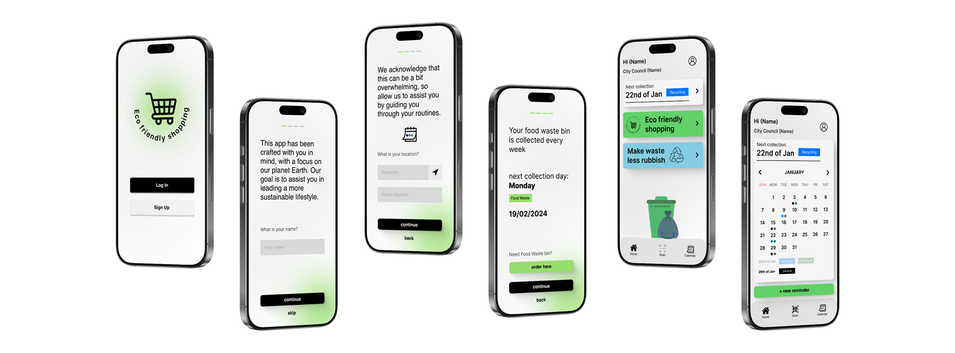
The Solution
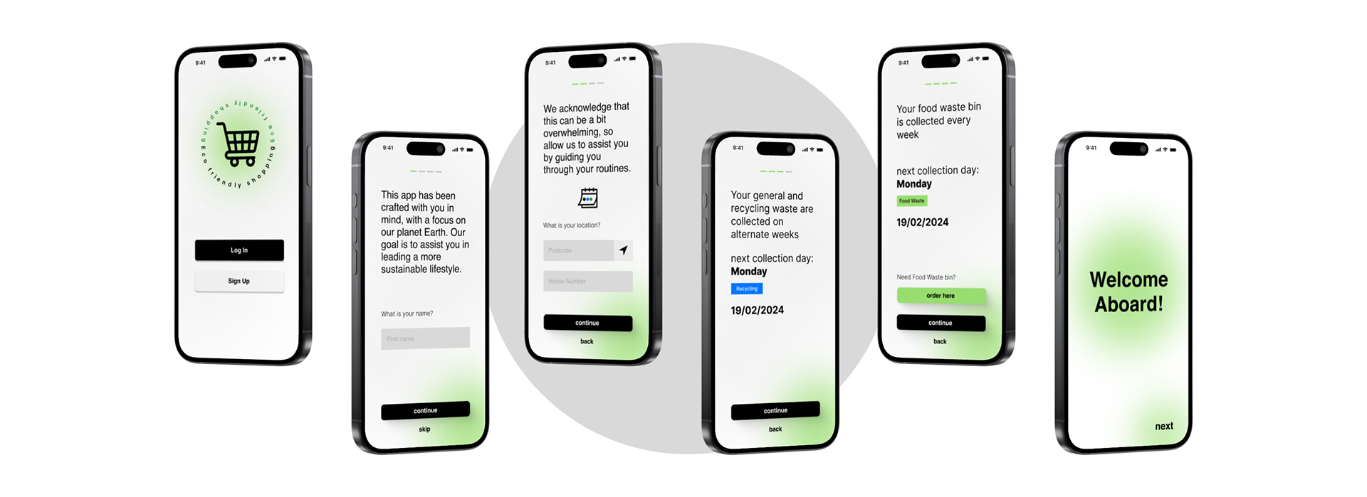
The app is built around one idea: give people the right information before they make the wrong decision.
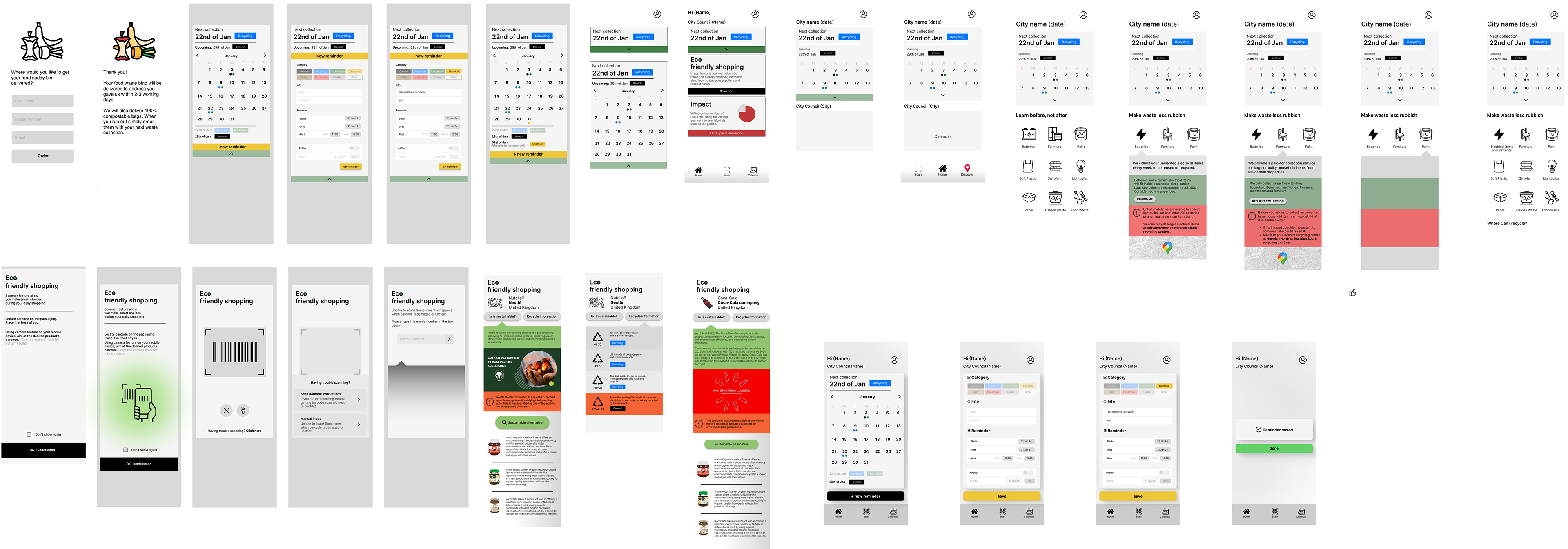
Onboarding starts by asking where you live. The app pulls in local council rules, waste collection dates, and bin ordering options, everything that previously lived on a landlord's text or a forgotten leaflet. These are saved to an in-app calendar with customisable notifications and reminder for less obvious tasks, like taking batteries to the nearest supermarket drop-off.
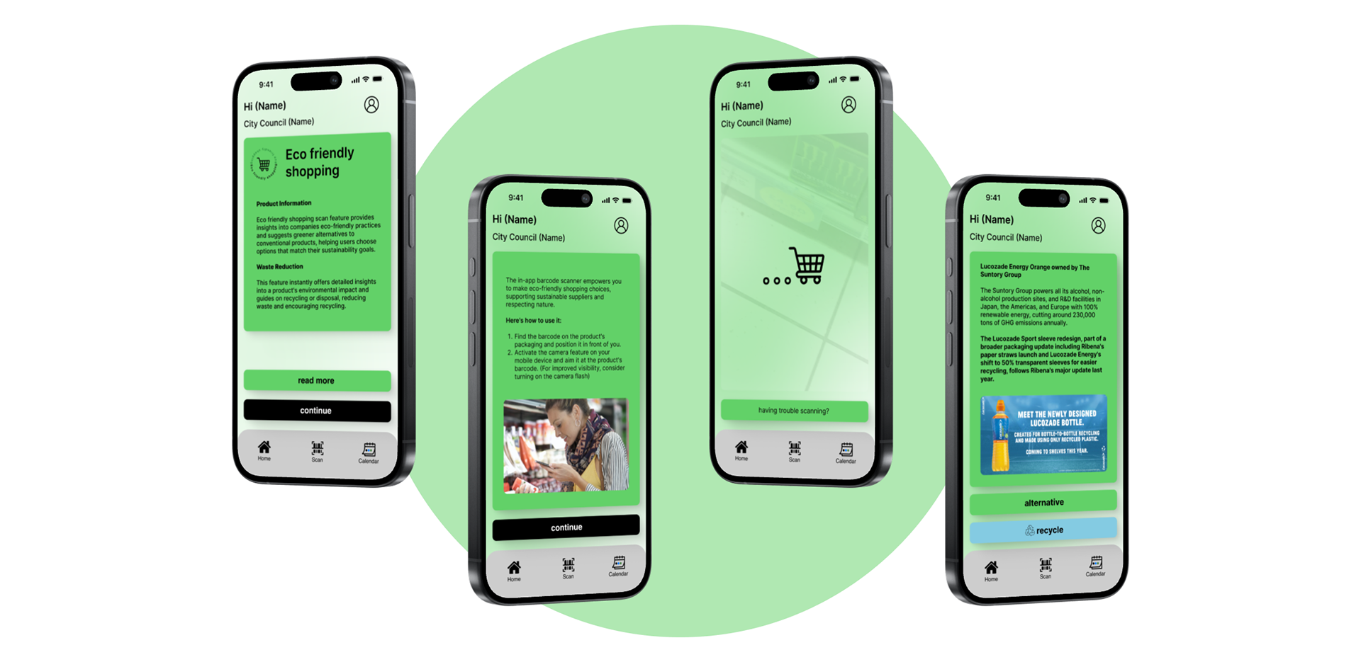
The scanner sits at the heart of the experience. Users scan any packaging and instantly find out whether it's recyclable and where the nearest recycling station is. One tap at the moment of doubt, instead of a Google search that never happens.
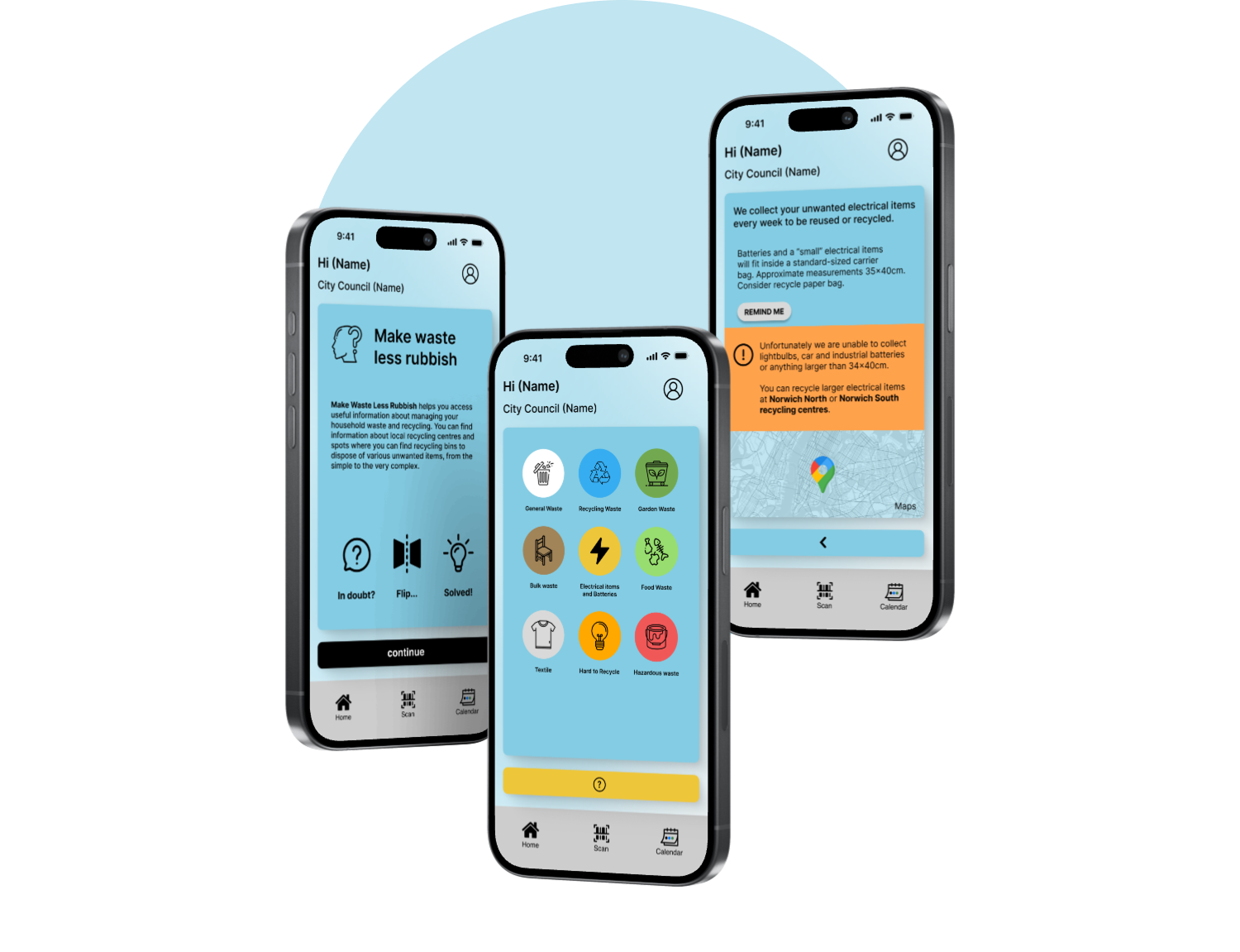
For everything that doesn't fit neatly into a bin, Make Waste Less Rubbish offers guidance on harder items like electronics, textiles, and bulky waste, with location-specific drop-off information throughout.
Outcome
As a concept project, there were no live metrics to measure against. Success was judged by a simpler standard: does the app make the right action easier than the wrong one, and can people understand it without explanation? Informal feedback suggested the location-based approach resonated most, particularly with people who had recently moved and felt let down by how hard basic recycling information was to find.
Reflection
The scanner was the feature I was most excited about, and probably the one I'd pressure-test hardest if this went further. The whole premise relies on accurate, up-to-date packaging data, and I left that assumption untested. I'd also want to explore whether the calendar actually changes behaviour over time, or whether notifications become noise people learn to ignore. Those are the two questions I'd want to answer before calling this anything more than a promising concept.