Industry brief / UX & UI redesign / Collaborative university project – 2nd Year University Project
Redesigning a smoother digital journey for wine discovery, events and checkout
Role
Co-lead UX/UI Designer
Research, competitor analysis, heuristic evaluation, user flows, wireframes, prototyping, UI development
Research, competitor analysis, heuristic evaluation, user flows, wireframes, prototyping, UI development
Platform
Mobile and desktop
Timeline
6 weeks
Overview
For this collaborative industry brief, I worked on a redesign of selected Virgin Wines digital touchpoints, including the checkout journey, Wine Tastings / Wine Events page, and About page. The brief responded to Virgin Wines’ recent rebrand and asked us to apply a fresher, bolder visual identity while improving the overall user experience.
The aim was not just to make the pages look better, but to make the journey feel more natural, enjoyable and commercially effective.
The Brief
Virgin Wines asked us to rethink three key areas of their website:
Checkout
Improving the flow from sign-in/account creation through to order confirmation.
Improving the flow from sign-in/account creation through to order confirmation.
Wine Tastings / Wine Events
Making event discovery clearer, more exciting and easier to book.
Making event discovery clearer, more exciting and easier to book.
About page
Creating a stronger brand storytelling experience that communicates Virgin Wines’ personality, values and tone.
Creating a stronger brand storytelling experience that communicates Virgin Wines’ personality, values and tone.
The brief also asked us to consider business impact, particularly how UX and UI changes could support clearer journeys, reduce friction and potentially improve conversion.
The Challenge
The existing experience had strong brand potential, but some parts of the journey felt inconsistent or unclear. Users needed to understand where they were in the checkout process, how to move through the event pages, and what Virgin Wines stood for as a brand.
The main design challenge was:
How might we create a more streamlined experience where users can browse, shop and discover Virgin Wines with confidence?
This became the central question behind the redesign.
The Research
Through competitor research, heuristic evaluation and journey mapping, we identified opportunities to simplify the checkout flow, make event discovery more informative, and turn the About page into a stronger brand storytelling experience
Developing prototypes
Our design approach was built around clarity, confidence and consistency. We wanted every touchpoint to feel purposeful, visually engaging and easy to navigate, while still capturing the bold and playful personality of Virgin Wines.
Below each section, we created a dedicated sandbox space in Figma, allowing us to explore layout variations, test visual ideas and develop each part of the journey before refining the final screens.
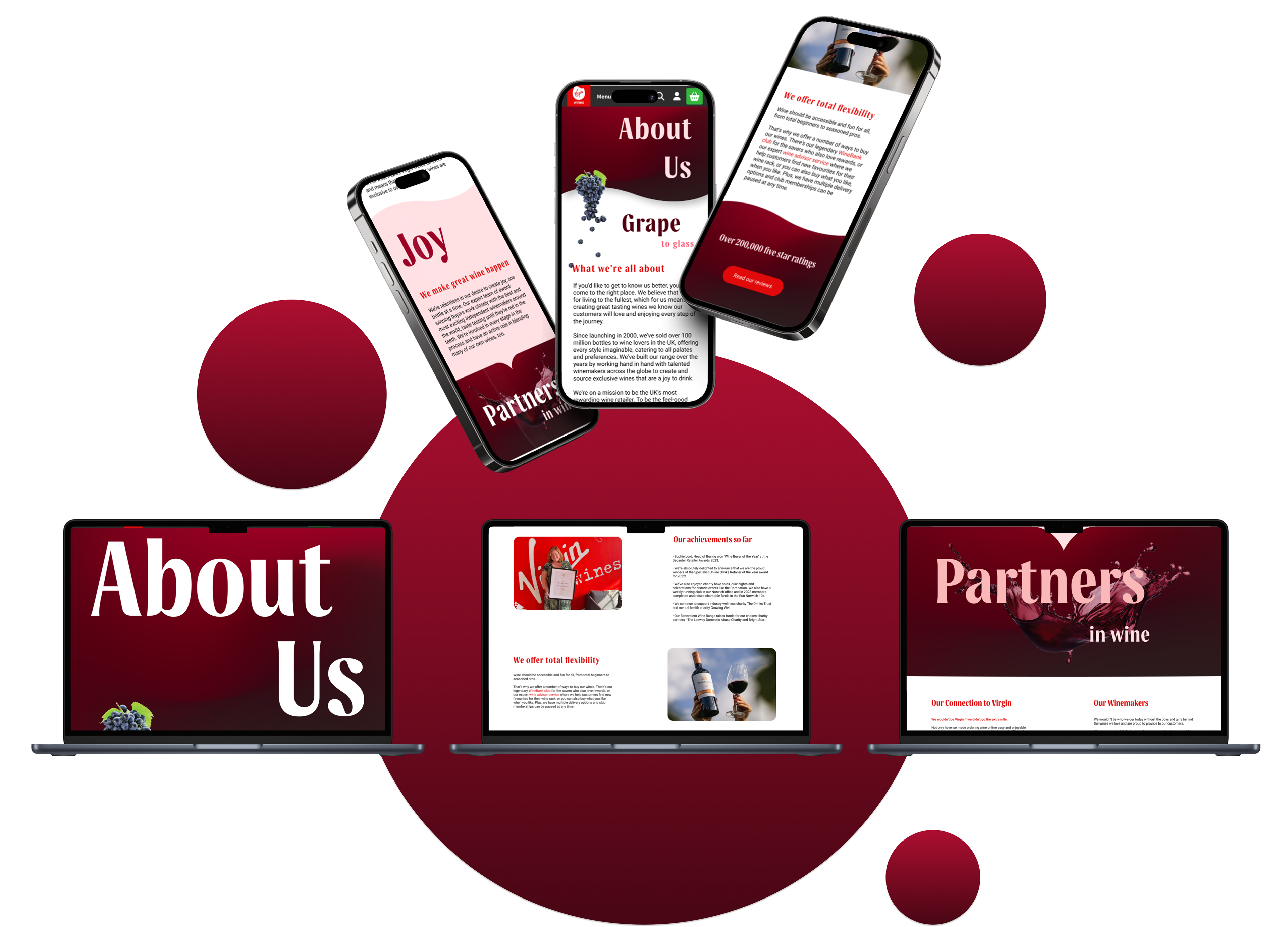
About Page
For the About page, we developed a more expressive structure that communicated Virgin Wines’ personality, values and tone of voice. The aim was to make the page feel less like standard company information and more like part of the brand experience.
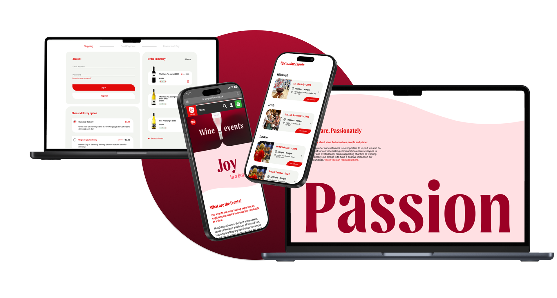
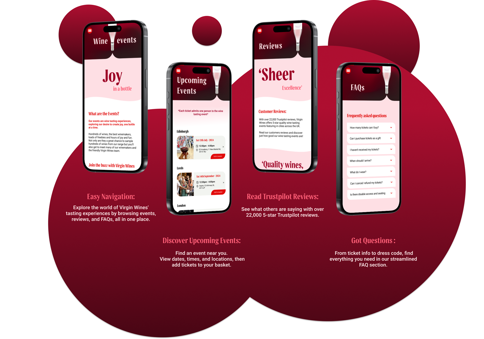
Wine Tasting Events
For the Wine Tasting Events page, we focused on helping users quickly understand upcoming events, locations, prices and what to expect before booking. This made the page feel more useful, transparent and experience-led.
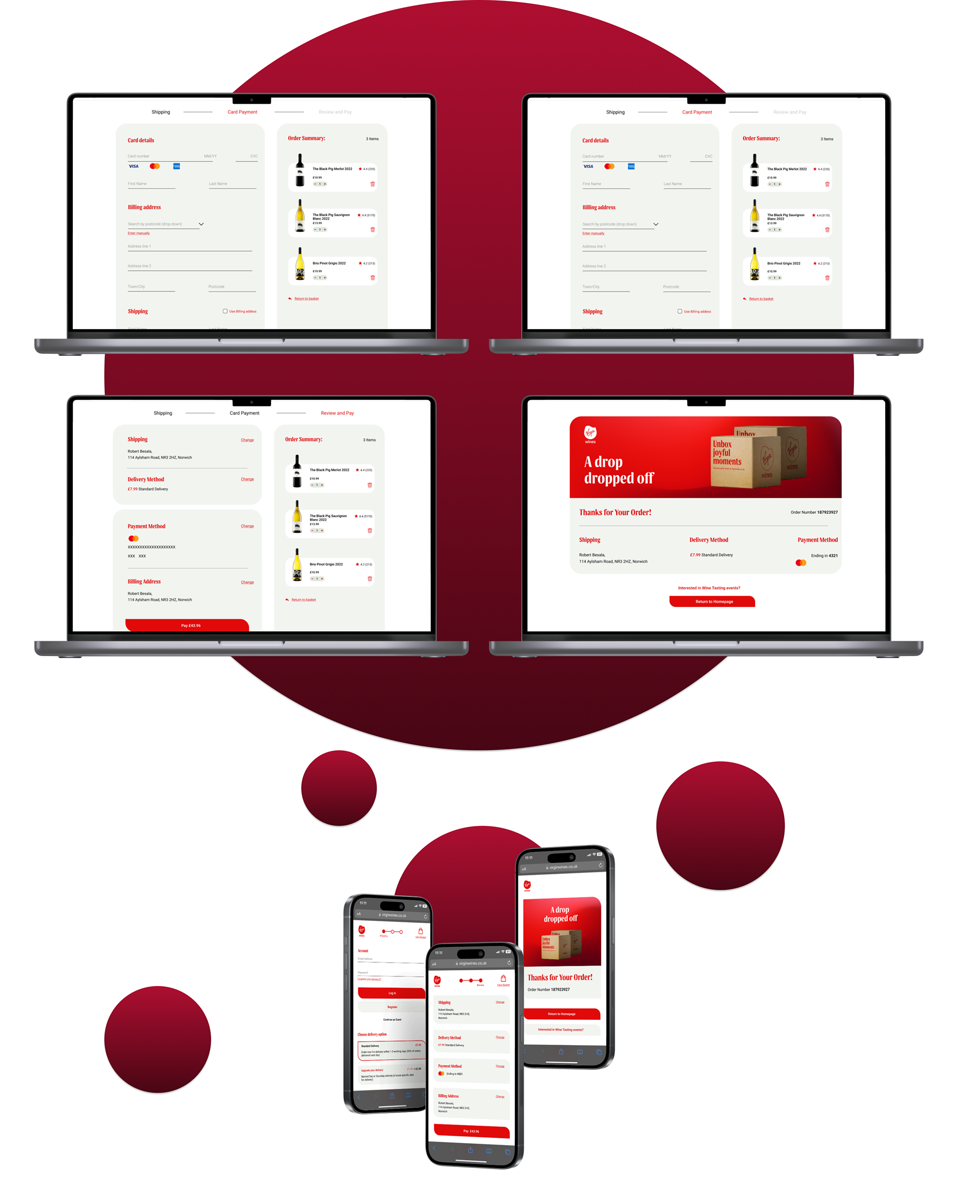
Checkout
For the checkout, we explored a clearer step-by-step structure supported by progress feedback, guest checkout and organised delivery and payment sections. The aim was to reduce friction and help users feel more confident completing their purchase.
Redesign
The final redesign brought together our research, layout exploration and Figma sandbox development into three key digital touchpoints: About page, Wine Events page and the Checkout journey. Each page was redesigned to improve clarity, strengthen the brand experience and make the journey feel more consistent across mobile and desktop.
About Page Redesign
For the About page, we developed a more expressive brand storytelling experience. Instead of presenting company information in a static way, the final design used stronger visual hierarchy, bold typography and clearer content sections to communicate Virgin Wines’ personality, values and tone of voice.
The outcome was a page that felt more memorable and emotionally engaging, helping users understand the brand beyond the product itself.
Wine Events Redesign
For the Wine Events page, we focused on making event discovery more informative and engaging. The final design helped users quickly understand upcoming events, locations, prices and what to expect before booking.
We structured the page around clearer event cards, practical details, supporting imagery and stronger calls to action. This made the experience feel more transparent, useful and experience-led, while still keeping the joyful tone of Virgin Wines.
Checkout Redesign
For the checkout journey, we created a clearer step-by-step structure that guided users through the process with more confidence. The redesign separated key actions such as delivery details, payment and order review into organised sections, making the experience easier to scan and complete.
We also introduced clearer progress feedback, guest checkout options and stronger hierarchy around the final purchase action. The outcome was a checkout flow that felt more efficient, less overwhelming and better aligned with familiar e-commerce patterns.
Project Summary & Evaluation
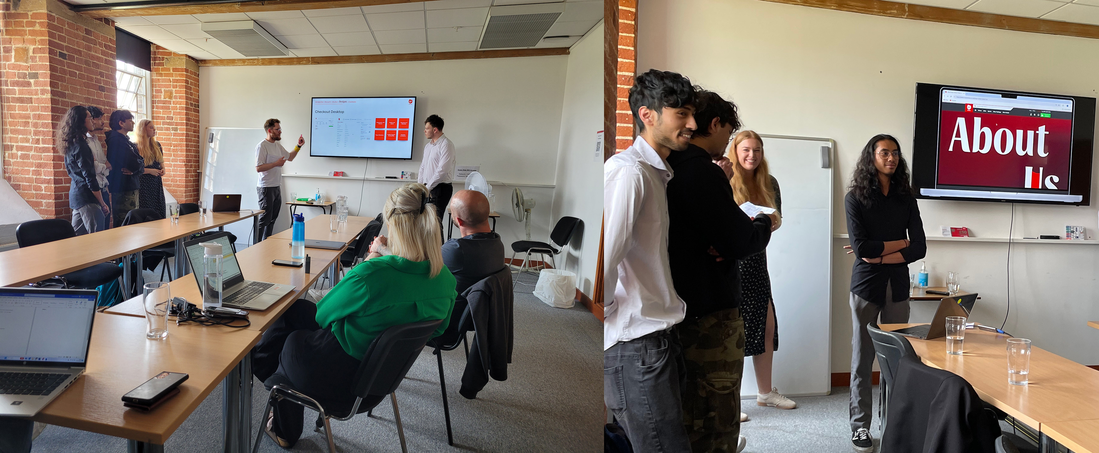
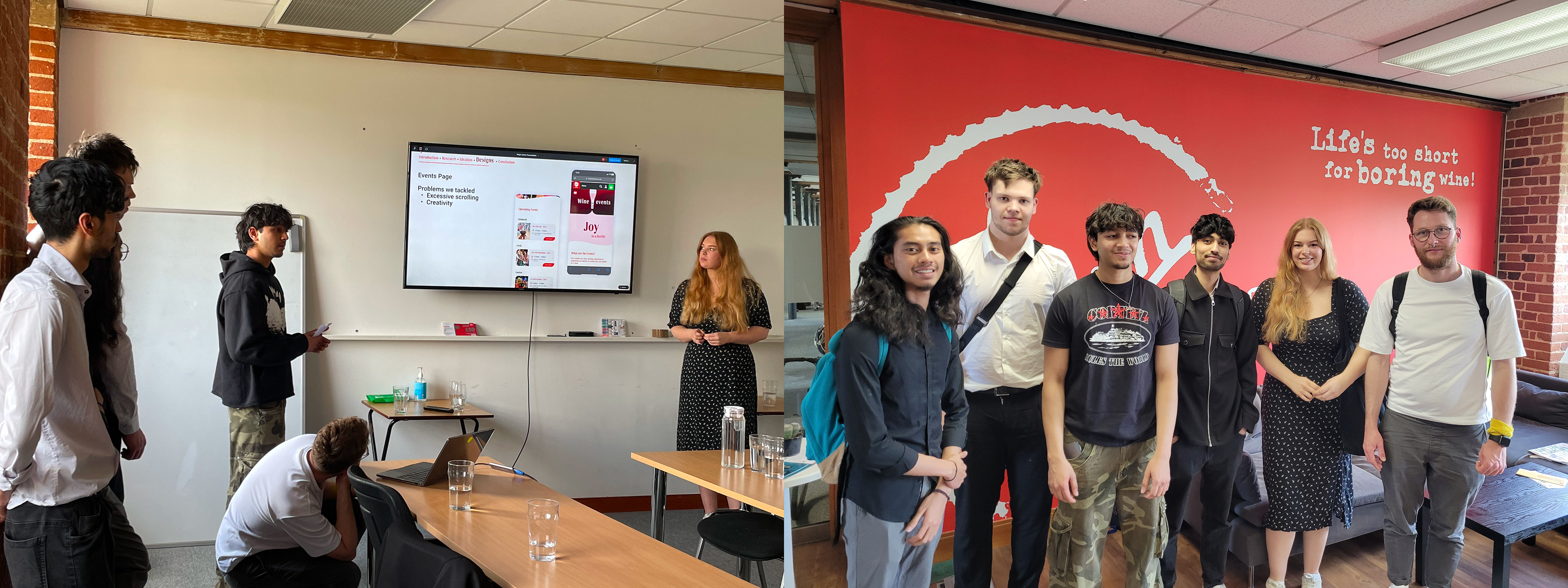
At the end of the project, we presented our redesigns to the Virgin Wines team at their Norwich offices, which was a valuable experience and gave us positive feedback on our ideas and design decisions.
This project helped me understand how UX and brand identity need to work together: a strong visual direction can make a product memorable, but the experience still needs to remain clear, accessible and easy to use. I learned that small UX decisions, such as renaming a section, adding a progress bar, simplifying microcopy or restructuring content, can make a big difference to how confident users feel.
I was particularly pleased with the checkout outcome and the quality of the UI work I developed across mobile and desktop. Designing a complex flow while parts of it were still being tested was a new challenge, so I had to stay organised and use components, variables and styles efficiently to make quick changes while keeping the whole Figma file consistent.